How to Useful SEO Reports
We do a lot of reporting.
So let’s talk about making a good SEO report.
I need some inspiration
Just looking for inspiration? We got you.
If you're looking a report presentation we've got one here in our knowledge library.
If you're looking for a dashboard template, you can download free Looker Studio SEO templates.
(Go make a copy, but then back here read this and change it).
What is an SEO report?
A summary we send periodically to other people about our SEO performance.
It's either a presentation or a
Step 1a: Who's the audience?
To start with you either want to pick the audience, or a big question you’re looking to answer.
If you don’t know the question, I’d recommend starting with the audience.
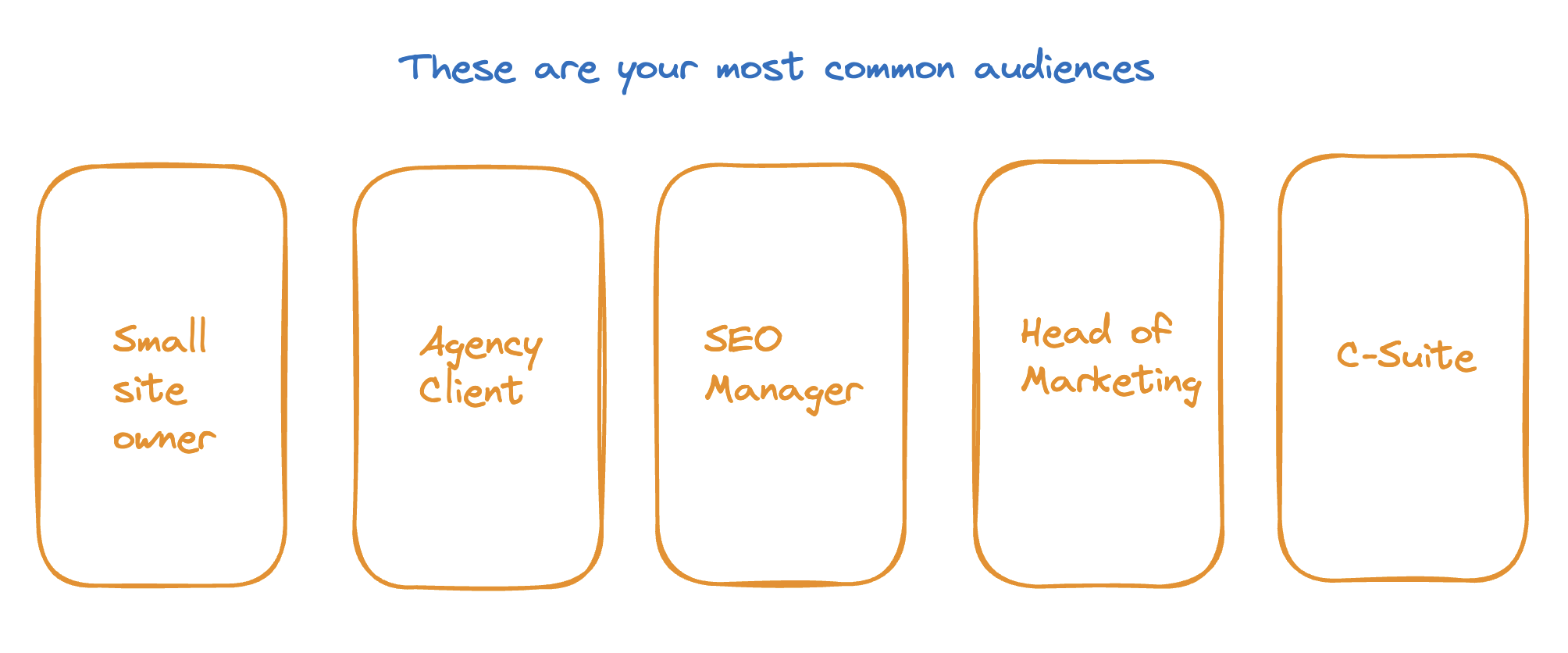
These are probably the most common:
- You, a small site owner who wants to understand their site?
- A client who you’re reporting to as an agency?
- An SEO manager in a company
- Your boss who runs the marketing team.
- The CMO/C-Suite
Step 1b: What’s the question(s)?
Once you’ve got the audience the question often comes easily. Which is good because we really need to cut down our options.
Here are some common ones we see.
Small site owner
- Which pages bring the most traffic to my site?
- Has my traffic changed?
An agencies client
- What results are you driving?
- Where do we rank for “x” keyword(s)?
SEO consultant
- Where & why has our traffic changed?
- Which keywords/pages do I need to optimise?
- How is our sites technical health?
- How is Googlebot crawling our site?
- How do we perform against competitors, should we looking into them?
Head of marketing
- Where should I invest my budget?
- Which problems should we focus on?
- Which SEO investments are getting the biggest ROI?
- Why is this channel under/over performing?
C-Suite
- How much revenue does SEO drive?
- What’s the revenue/cost of our SEO traffic?
- How can we reach X target. If we spent more/less money how would it change things?
Sometimes you’ll be coming to this with a question rather than audience
Often it means you have a more tightly scoped question.
- How many pages do we have indexed?
- How is our sites technical performance changing over time?
- How do we compare against our major competitors with site speed?
- How has our traffic changed?
- Have we hit our quarterly targets?
Figure out your question and then we move onto the next step.
Step 2: Which metrics do we want?
No-ones going to want a report based on vibes, we’re gonna need some numbers.
Finding the metrics which answer our questions is really important.
We can broadly group our metrics into:
- Input metrics
- Output metrics
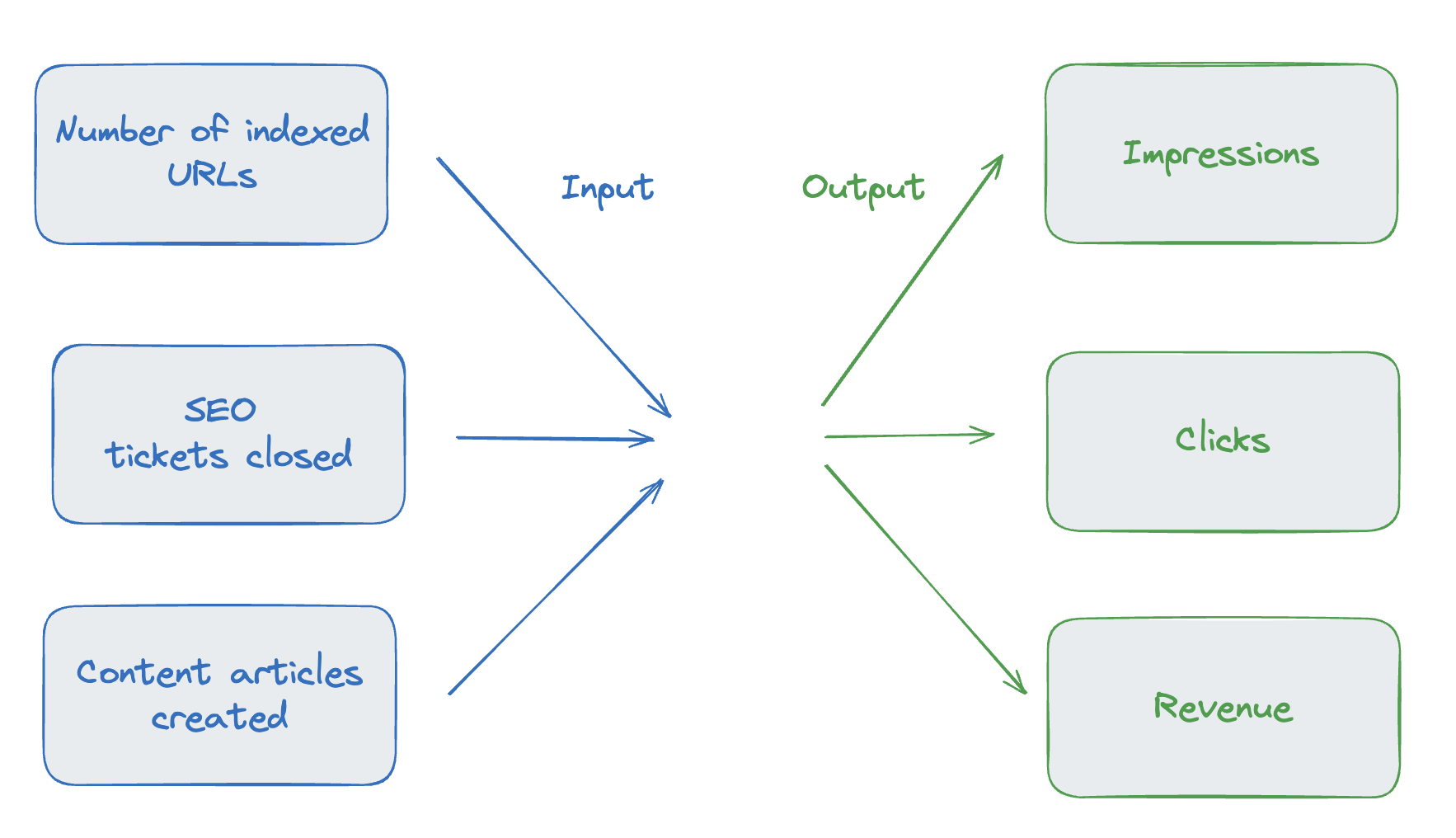
Input metrics
Input metrics measure inputs to our SEO results, they’re things like:
- Number of content articles created
- SEO tickets closed
- Indexable product pages
- URLs with canonical tag issues
Output metrics
Output metrics are what we get from SEO:
- Revenue
- Conversions/leads
- Clicks
- Sessions
- Impressions
Should I pick input metrics or output metrics?
Different questions will want different metrics.
As a general rule, picking & measuring good input metrics is a lot harder than doing it with output metrics, so depending on time/budget/capability you might lean one way or the other.
If you’re on the smaller side, you probably don’t need to be carefully measuring your input metrics, you probably know most of what is going on.
As you get larger it tends to become more important.
I would say we see people go through a couple levels:
- Basic output metrics: They report on basic output metrics like rough revenue, sessions etc.
- Improved output metrics: They spend more time and improve their basic metrics. e.g. building valuable session definitions, better weighting for search visibility, more accurate revenue, pulling in additional comparisons.
- Input metrics: They start trying to measure input metrics.
- Honing input metrics: They start building up a library of input metrics to switch between as they measure effectiveness.
For most people reading this I suspect the answer is output metrics. For those of you who are bit more ambitious/advanced aim to add on the input metrics.
Tom Critchlow has an excellent post on input metrics that you should go and read which talks in a lot more detail about input metrics.
Picking the right metrics
Ok so lets take our questions and translate them into metrics.
Which metrics
Sometimes this will be really obvious:
- How much revenue does SEO drive?
- Revenue
- Conversions * AOV/LTV
- What’s the revenue/cost of our SEO traffic?
- Revenue
- Cost: Tools, salaries, agency budgets
- Are we meeting our internal organic targets?
- Sessions
- Session Targets
- Are we out performing our competitors in visibility?
- Visibility
And sometimes it won’t be as obvious and you’ll have to use your knowledge as a marketing professional to answer it:
- How is our sites technical health?
- Number of landing page URLs which are 200 & indexable
- Number of major issues raised in quarterly audits
- Where should I invest my budget?
- Cost
- Estimated impact
- Sessions
- High quality sessions
- Revenue
- Estimated effort
- Hourly estimates from development spikes
- Marketing team quarterly plan.
Compromising on metrics
Ok great. So we picked our ideal metrics and have the best intentions.
You’ll then realise you can’t get half of the metrics you actually want.
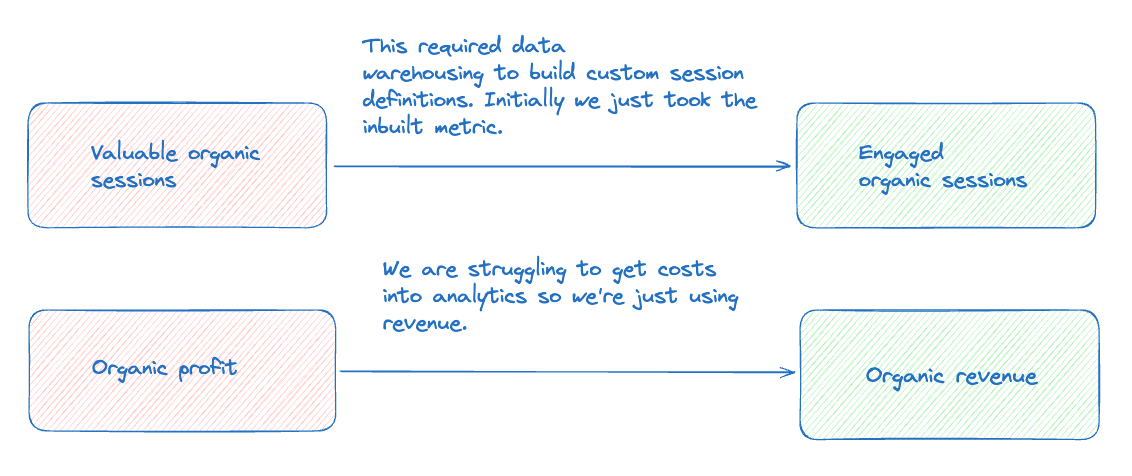
Maybe they require analytics capability you don’t have.
Maybe you’re missing the tools that provide them.
Maybe they’re retroactive and nobody was keeping track of them.
This is going to happen, reporting & measurement is more of a journey than a “now I’m done”, so pick a bunch in each case and do the best you can.
A quick walkthrough of common SEO metrics
It’s probably useful to have a quick walk through of some common SEO metrics at this point and when you can use them.
- Sessions
- What is it: How many individual browsing sessions happened on your website
- How to use it?
- It’s a good default.
- You can improve it by building a definition of valuable sessions.
- It’s often better with YoY
- What are it’s weaknesses:
- Easily affected by seasonality (i.e. you get more sessions at Christmas rather than October).
- Filtered by ad blockers.
- Not all sessions are equal.
- Clicks
- What is it?
- How many people clicked on your site in Google.
- How to use it?
- Another good default
- Often better with YoY.
- Typically you want to use it with query as dimension (i.e. what keyword did people search for), otherwise sessions will often be better.
- What are it’s weaknesses
- Not all clicks are equal and this is harder to segment.
- Easily affected by seasonality.
- Can’t tie to revenue or conversions easily.
- What is it?
- Revenue/Conversions
- What is it?
- How much revenue/conversions are you making?
- How to use it?
- Obviously useful, it’s the end goal.
- Often better over aggregated by week/month. Can be noisy.
- Often better YoY.
- What are it’s weaknesses?
- Attribution is hard for revenue, a sale/purchase often isn’t on the spot.
- It’s really noisy.
- Conversion rate/product selection etc. can massively affect this.
- What is it?
- Rank
- What is it?
- For a single keyword what rank do you appear in?
- How to use it?
- A good default.
- Less affected by seasonality.
- You need across a good representative set of keywords.
- What are it’s weaknesses?
- Assumes all keywords are equally valuable.
- Affected by SERP features.
- Ranking isn’t traffic.
- What is it?
- Search visibility
- What is it?
- A number which sums up how visible you are in a search engine
- How to use it?
- Pick a good set of keywords. Keyword set is really important.
- Less affected by seasonality.
- Doesn’t assume all keywords are equally important.
- What are it’s weaknesses?
- You need to pick a good keyword set.
- If you’re working based on volume, it’s easily swung towards large keywords.
- CTR estimates are often pretty rough.
- What is it?
Step 3: Report or Dashboard?
Ok so at this point we’ve got an audience/questions + metrics we want to use to answer them.
Let’s go back to our question and audience. What’s the right format for answering this question?
Is this for a board meeting?
- You should probably get prepping a slide deck.
Is it for the head of marketing to check in on every Monday?
- You might want a dashboard that automatically updates.
Let’s expand on that a bit more.
When are reports right?
These are great because you can add context!
Here’s a really really basic example. The same graph taken from a dashboard. Which one tells a story?
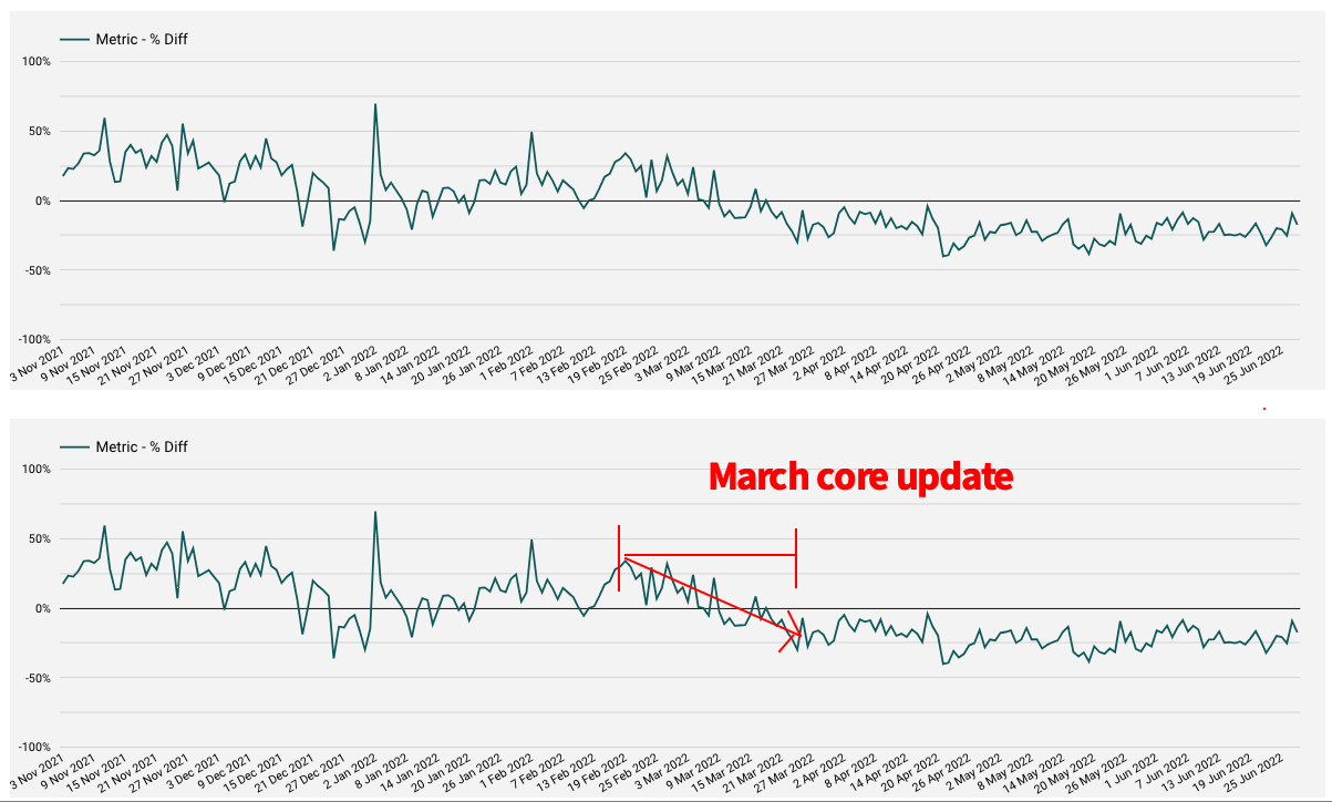
If you’re reporting to people (particularly more senior ones) telling the story around the numbers is almost as important as the numbers themselves.
And you’re almost always going to want this.
When are dashboards right?
When is it right for dashboard?
Two big places:
- Getting the numbers for reports.
You really don’t want to have manually collect all the data every time. Often a dashboard(s) will sit behind a report letting you quickly get the numbers for the report.
- Letting people look at the data themselves
Often people will want to be able to look at the data themselves and they’ll find a way of doing it. If you give them the dashboard you can control what gets seen and make sure everyone is seeing the same thing.
Step 4: Going to get your metrics
Right we’ve decided on our numbers. Where do we get them?
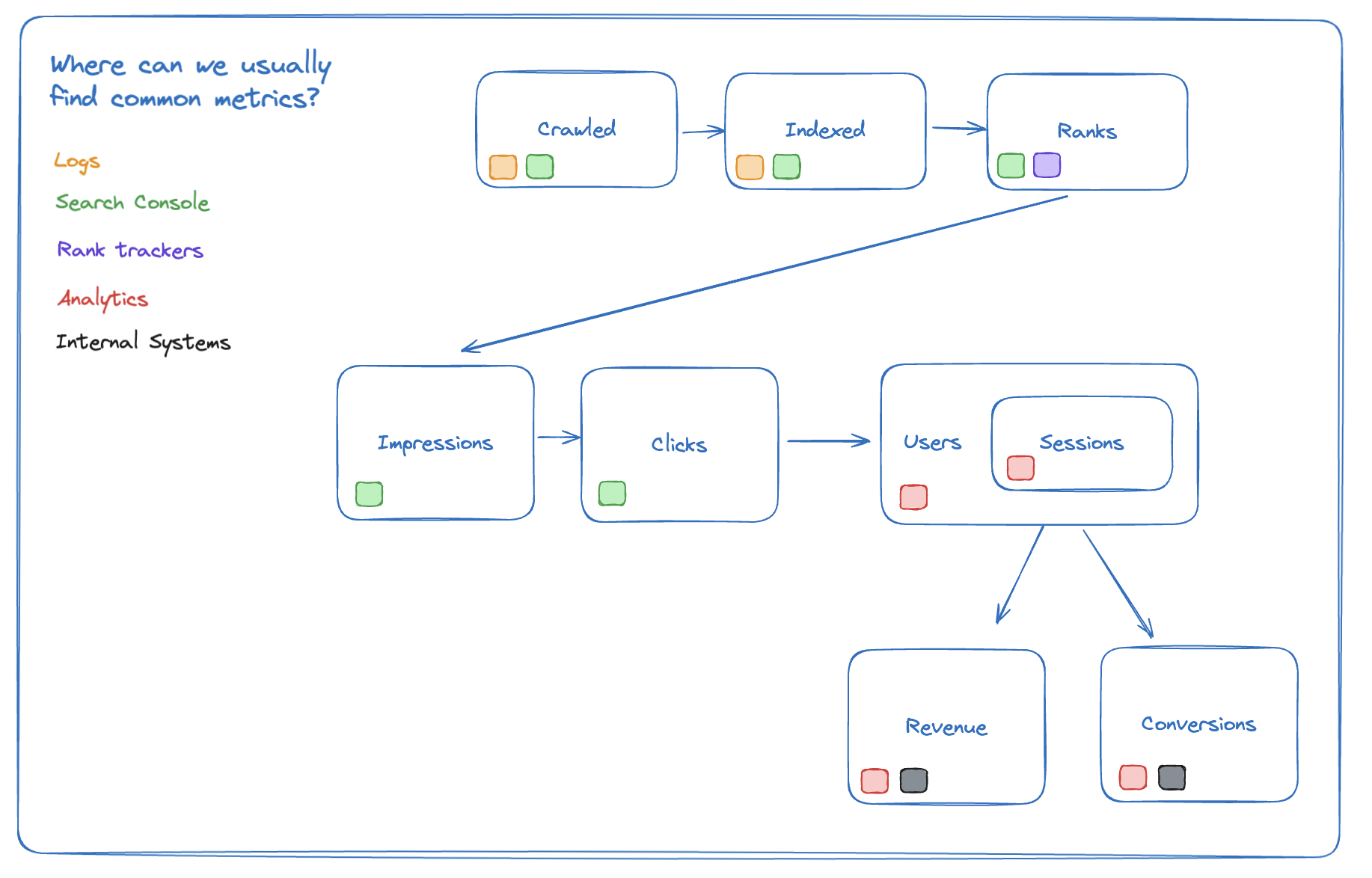
Probably some combination of analytics tools:
- Search Console
- Analytics Tools: GA4, Adobe Analytics, Plausible etc.
- Third Party Tools: Ahrefs, SEMRush, Moz etc.
- Log files
- Crawl software: Sitebulb, Screaming Frog etc.
- Internal software: Jira, Trello etc.
Typically you don’t want to just screenshot interfaces, you’re going to want to download the data and then either turn it into graphs in Excel/Google Sheets or generate a dashboard in something like Looker Studio or Power BI
How do you get numbers out of these tools?
Export to CSV
Often you’ll be relying on the export to CSV function.
You’ll open the tool, export the data, put it into Excel. Make a chart/graph.
Paste the end result into a report or send over the spreadsheet.
Straight to BI platform
Other times they’ll directly connect to dashboard software like Looker Studio or Power BI, which is great because it makes it vastly easier for you to make reports.
You’ll connect the data source, make a number of graphs and tables.
Save the dashboard, share it and then when it comes to reports screenshot the parts you want.
Data warehousing
When you start hitting limitations with these tools, find yourself doing a lot of data grunt work you’re going to want to start looking at something like a data warehouse (and please consider reaching out to us at that point!).
At a certain level of size and complexity this is pretty much where everyone ends up.
Step 5: Visualising your reports & dashboards
At this point we again come back to step 1 and the questions we’re trying to answer.
At this point we have:
- The audience
- The questions we’re trying to answer
- The metrics we’re going to use answer it.
This is going to vary massively depending on your question so here we’re going to give some general advice and about generating useful numbers and charts.
Don’t put too much on the same chart
Here’s an example from our CrUX report.
The question: How fast is our site?
The audience: Marketing manager/Head of marketing
The metrics: LCP, CLS (these are all different ways of measuring site speed).
How can we display this?
We have multiple metrics, but we also want to show visually how well someone is doing.
We can’t easily show multiple metrics (LCP, CLS etc.) and a breakdown (good, needs improvement, bad) on the same chart. It would be too much.
Instead we show one metric at a time:
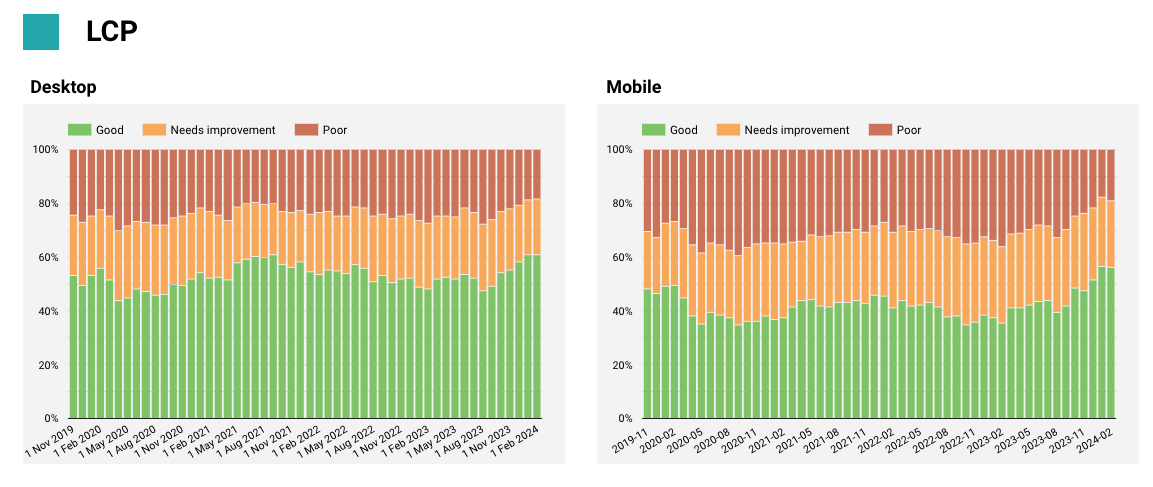
And in this case we’ve segmented by device.
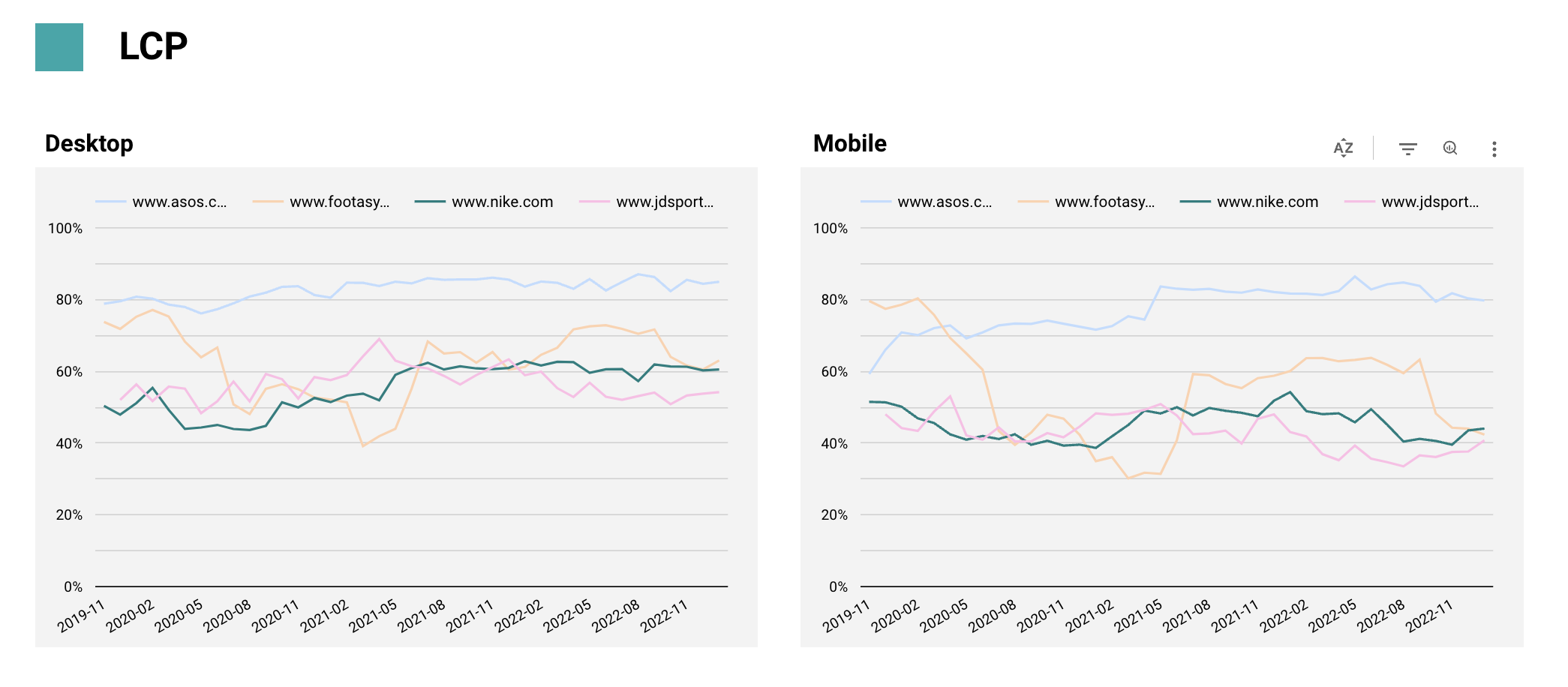
Adding in competitors
Then we need to handle more complexity. Showing competitor site speed is often highly motivating/important context.
We can no longer show the breakdown by good/medium/bad, so we reduce again and just show good by default and let people filter the graphs for more detail.
Think about your colours
Sometimes you’re a bit limited with colour (particularly in a BI platform), but keep an eye out for places that you can use it to increase clarity.
Take this screenshot again from the CrUX report.
We’ve put all the competitors in a lighter background colour to allow people to differentiate them while still keeping the focus on us vs the competitors.
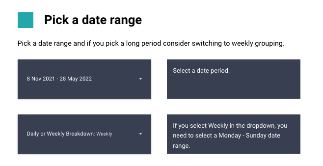
Group your data depending on the date range
If you start selecting long date periods, it gets hard to read daily data. Look at this noise.
(If you want to see this in practice, have a play around with this on our search console looker studio template.)
It’s hard to pull our the underlying trend.
Switch to grouping by week and immediately the pattern is more clear.
A common option you can provide on a dashboard is the ability to switch between different groupings of data:
- e.g. Daily, Weekly etc.
And we often provide this widget on our dashboards to let people change between them.
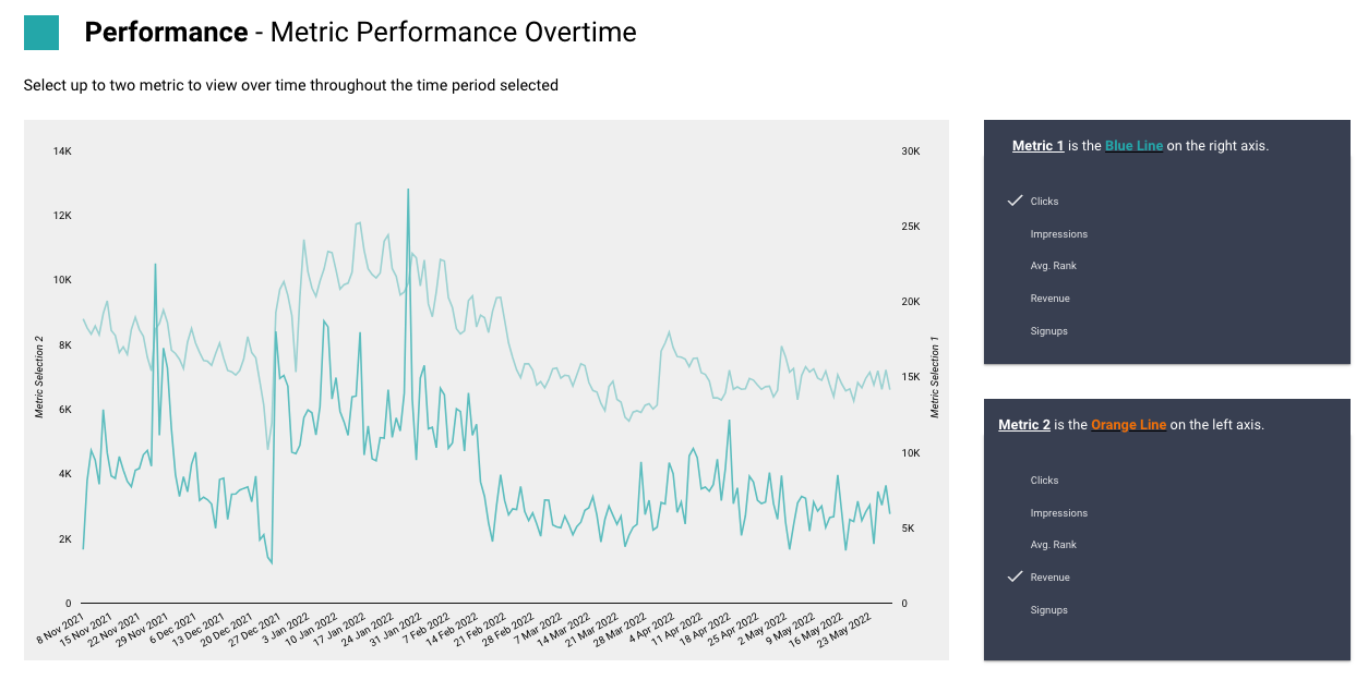
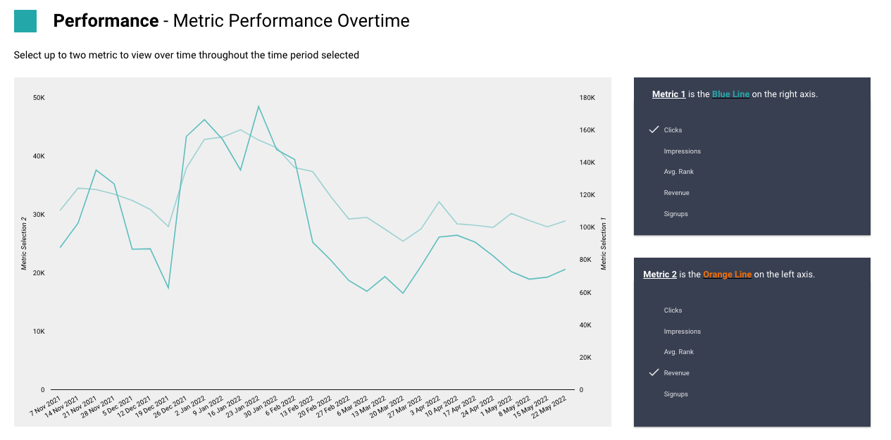
Let people switch metrics
Keep an eye out for places where it would be super valuable to switch metrics.
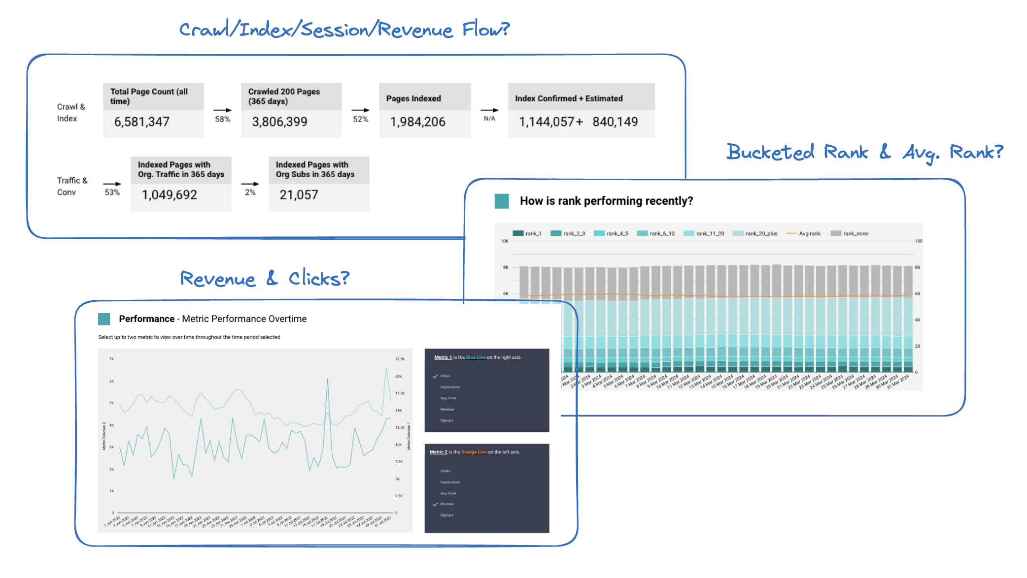
Typically this will happen if you’ve got a dimensions heavy dashboard. Take our dashboard for understanding traffic changes.
To understand where the change is happening you need to see a metric (e.g. sessions) broken down by many different dimensions.
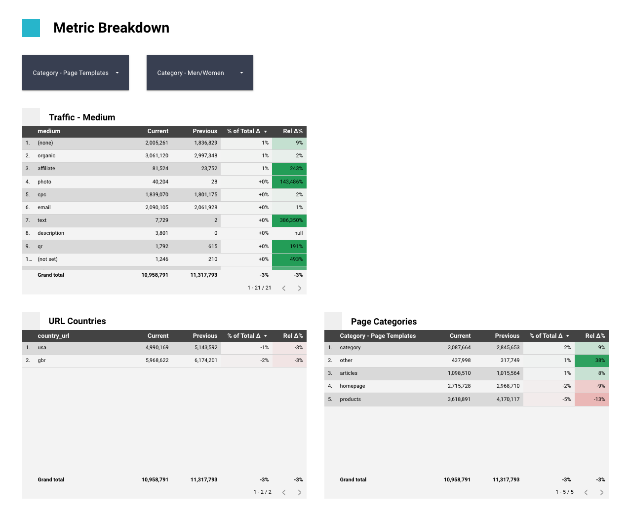
But the immediately follow-up question is what about revenue? Was that affected in the same place?
We let you switch between metrics, so in this case you can re-use the entire dashboard to also check revenue.
In Looker Studio this is done with parameters but the technique applies to most other BI platforms.
Free Templates
If you need some inspiration to get started, we’ve got both of our free SEO looker studio templates and a free GSC looker studio template that you can download to take a look at.
But remember unless you’re just looking for something really basic, you’re going to benefit from customising and personalising it for you.
Want some help getting good reporting?
That’s what we do!
You can find examples of some our reports that answer specific questions here.
Not only are we good at making the reports, more importantly we're really good with the underlying data.
We can help you get more from GA4, pull out the most interesting parts from your log files and help you make sense of extended SERP scrapes. We're good with data and we know how it gets used.
If you're having reporting/data challenges get touch, we'll be able to help, even if it's pointing you in another direction!