How to setup our GA4 Looker (Data) Studio Template
This is part of our SEO Looker Studio report template series.
Want to see your SEO traffic, but not touch GA4? We've built a free Looker Studio template you can download from our resource library to get you started.
GA4 TemplateThere are lots of caveats and compromises made on this dashboard and we’re gonna talk about them, but here’s the crux of it.
Sometimes you just need the basics
GA4 is great for analysts and data people, we really quite like it. But we spend 90% of every day working with SQL and databases. That is not most people.
It’s definitely not me of 10 years ago, spinning up websites and opening GA every day to see how my blog post is doing.
If you’re just getting started, or need a quick solution this Data Studio dashboard should get you going.
What does this dashboard do?
Every dashboard has jobs it helps you do. What does this one cover?
- Where does my organic traffic come from?
- My organic traffic has dropped/gone up. Why?
- Which pages/segments are doing particularly good or bad?
We’re going to go through them, but first here’s how to set the dashboard up.
How do you set up the dashboard?
Step 1: Make a copy of the Google updates sheet
You can find that here.
Remove any you don't care about and add ones that are missing that you want.
2. Create a data source to Looker Studio
You might notice if you tried to jumping straight to copying the report that you won’t be able to see your default GA4 connectors.
Instead you'll need to add a data source and set it up first. Here's how you do that.
Open up Looker Studio > [Create] > [Data Source]
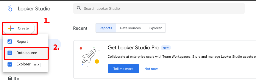
Then you’re going to:
- Name it
- Select your site
- Select URL impression
- Select web
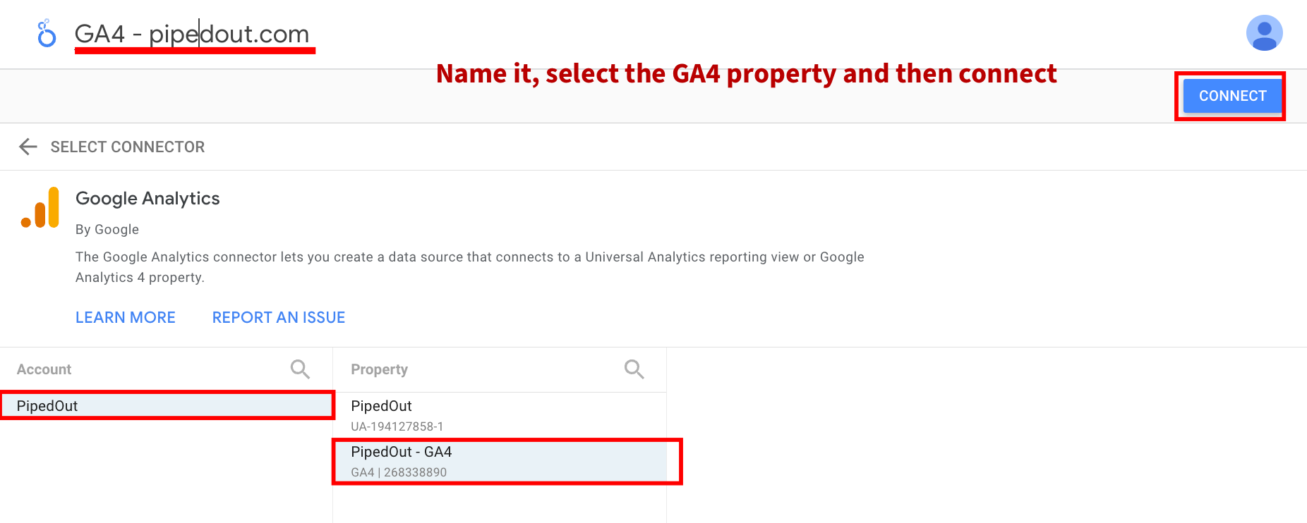
Now we're ready to setup the data source it.
3. Editing the data source
There are two big things we need to do:
- Create custom fields
- Add custom parameters
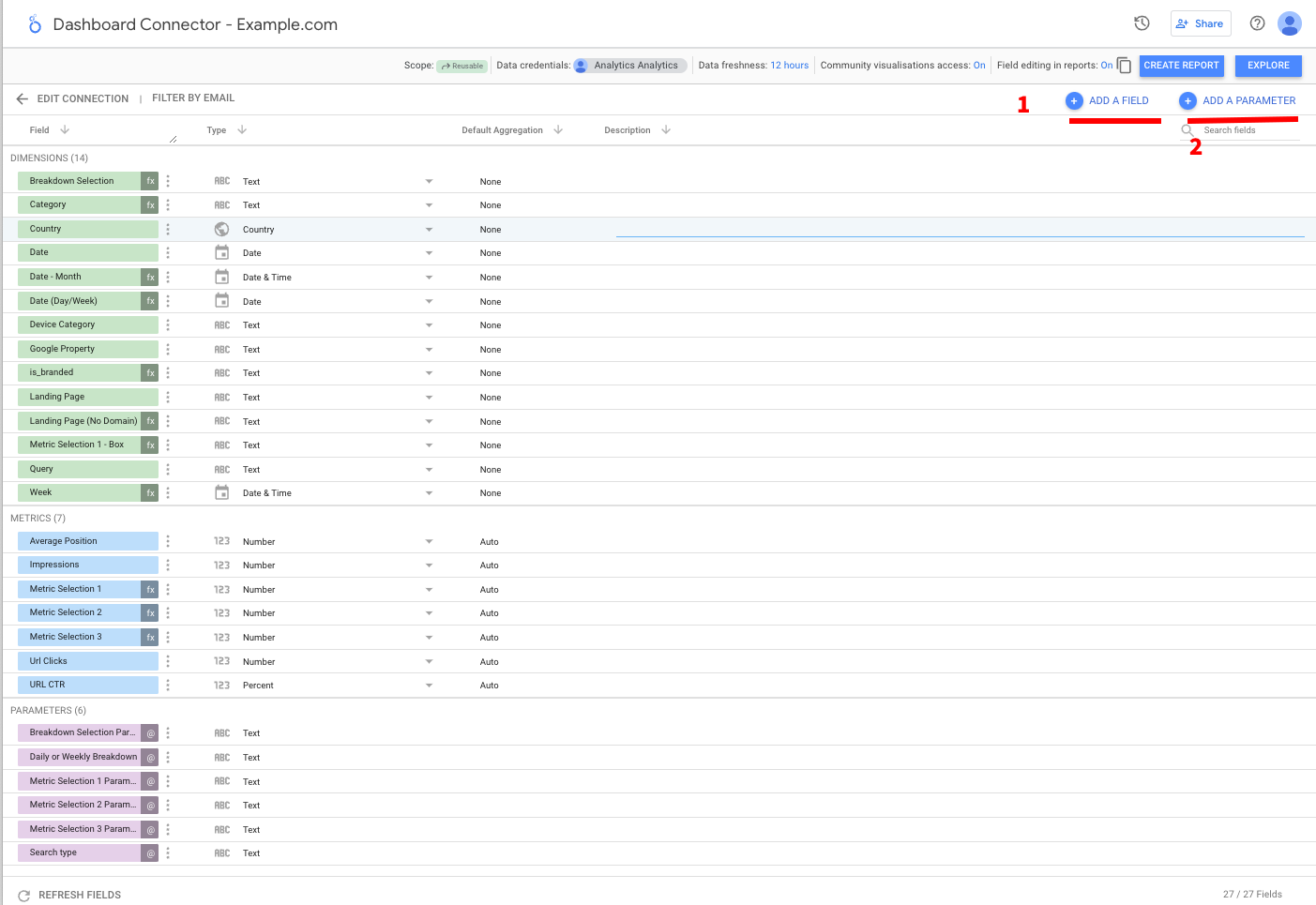
There’s quite a few of these so we’re going to walk through them one by one.
3a. Parameters we need to add
You’ll first need to go through and make all these parameters. The form looks like this:
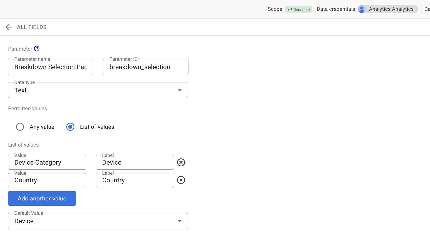
Here are all the ones we need to make.
Breakdown Selection Parameter
- Name: Breakdown Selection Parameter
- ID: breakdown_selection
- Data Type: Text
- Permitted values:
- List of values (value, label):
- Device Category, Device Category
- Country, Country
- List of values (value, label):
Step 2: Make a copy of the report
You’ll find the button here.

Update it to use your GA4 profile and the newly copied Google Sheet.

Step 3: Personalise the categories & filters
There are two updates you need to do here.
- Update the content filter to match the URLs on your site.
- Update the page categories case statement to match templates on your website.
Filters
Categories
The general format of the categories case statement is as follows:
WHEN {URL MATCHES THIS CONDITION} THEN {NAME IT THIS}

e.g.

WHEN (regexp_contains(Landing page, r"/[Bb]asket$")) THEN "cart & checkout"
If you’re not comfortable with regex you can use regex 101 to check it's working or if you just want contains then this format says contains “category”.
WHEN Landing page LIKE '%/category/%' THEN "cart & checkout"
Step 4:
You're off to the races.
Back to how to use the dashboard.
Job 1: Where does my organic traffic come from?
First an over time summary
Right at the top of the dashboard we have 2 overtime graphs and some summary numbers.
We can at a glance see any quick trends in either revenue of sessions.
Personalisation hint: If you want view this over longer time periods, it might be worth making a copy of this page and turning the date interval to weeks. Days are hard to read over long time periods.

Then we dig into segments
The rest of dashboard is all about segmentation.
We have a series of segment breakdown tables below, these all cross filter, so if you pick any segment it will filter the rest of the dashboard so we can see how it performs over time and how it breaks down across the other segments.

At the end we show URLs
Finally we have our URL level data. At this point if you’ve left any filters running you’ll only see the URLs, for that segment so we can quickly see our content, products etc.
Also algorithm updates
We’ve joined this data with a spreadsheet of algorithm updates. It will appear over the top of the data with a red line (like you can see in the image).
We took our list from this excellent Search Engine Journal algo reference.
You’ll probably want to pick the specific ones relevant to you rather than have all of them. But you could also have all of them.
Personalisation tip:
Outside of handful of industries I personally fall into “ignore, keep calm and carry on” approach to Google algorithm updates, but we know plenty of people don’t!
If you don’t care about algorithm updates, you can just switch the data source away from the blend and turn the graphs back to time series.
Job 2: My organic traffic has dropped. Why?
Data is always more useful in context and that context usually is:
- My traffic has gone up/down. Why?
For that we have a second page with period comparison. It’s identical to the first page but with a handful of changes.
Now for each segment you can see how it's changed against the previous year, allowing you to see if it's seasonality or actual changes affecting your traffic in a basic way.
Everything now has a period comparison.
We’ve set YoY (because its the best way of compensating for seasonality), but again you could customise to whatever you want.

Because we're using the default built in connector we can't do the most useful period comparisons here. You can see this example from our BigQuery GA4 example template, where we're able to show percentage of total change and it's the most useful of ways to breakdown change.

No on algo updates on the graph
We can’t show algo updates on the graph due to restrictions with Looker Studio. You could manually add them on as reference lines if they’re particularly important.
We have still kept them in the table and it cross filters so it will show any google updates in the time period you have.
Job 3: Which segments or pages are doing particularly good/bad?
Finally we show you the top pages which have increased/dropped for sessions and revenue.

Personalisation note: We provide two segments an overall and a content one, although of course you could just copy and personalise to your hearts content.
There are limits here primarily around calculating percentage change in Looker Studio. You’ll note in the image many of the rows are very green. This is because there is one large value dominating and blowing out the heatmap.
There are 2 options here:
- Filter out any particularly big segments on your site and show them separately.
- Move off the default connector.
Period comparisons aren’t the greatest so the highlighting is hard to setup. For the best possible insight we would also show either a weighted percentage change or show the change as a percentage of the total, but setting that up without some sort of data pre-processing like BigQuery is very hard.
What can’t it do?
This dashboard is made entirely with the free GA4 connector provided by Google so we have some certain limits.
When you bump into these limits, you’re probably going to want to move towards data warehousing (which is what we do). If you’d like help with that please reach out to us, otherwise it’s time to get in touch with your BI team to help you get that setup!
Sampling & cardinality:
We’re not super likely to hit sampling/cardinality for this report.
But if you run this dashboard for a long time period or put it on a huge property then we can plausibly hit this (cardinality is more likely than sampling, but both are possible).
Speed
It’s not a particularly quick dashboard and there isn’t anything we can do about it, we talk about that at length in our blog post - why is your looker studio dashboard slow.
No personalisation of metrics:
We can’t personalise the report metrics to our business. Some standard alterations that would make our reporting notably more insightful:
- Changing the definition of engagement: We know our visitors & customers and what we’d count as engagement.
- We should define engagement based on our page type a basic example would be something like: category pages should trigger based on filtering, clicking a product or refining a search.
- Comparing user segments: We’re subject to the same user limits as the rest of GA4, 14 months maximum retention for user data and we only get the segments that GA connector has. Not ideal.
Which brings us onto:
No changing attribution
LNDC attribution is not a good model of how people buy.
If we’re trying to attribute credit and understand what is working, we can gain a lot from customising our attribution model, we don’t have to move to complex ML, just picking something slightly more sensible like time decay will help a lot.
Hard to join with other data
Not impossible. You’ll note we have an algo updates section.
But blends in Looker Studio, are slow, fiddly, prone to causing issues and super hard to debug.
We can join with other GA properties more easily (although it will slow down our dashboard a lot), but more complex joins like search console, crawl, logs, or internal conversion data will be hard/impossible.
Playing around with time periods
Doing anything other than a single time comparison will be difficult. We have to use blends to accomplish it and as covered above they are slow, fiddly and hard to debug.
API limits
The GA4 API has quota limits. If it’s just you using a report for a small site, it’s unlikely to be a problem.
If it’s you and a team and lots of data its possible to hit and which point your dashboard just stops working until the quota renews.
Because this is a public GA4 property you might open the report and see this.

Period comparisons are not the greatest
When traffic is 16% down, we want to know where that 16% is coming from.
Take this table:
- The relative sessions change is what we get in the default connector.
- The % of Total Sessions change is what we actually want most of the time.
We can see categories is actually responsible for more of the drop than the homepage.
Conclusions
If you’re just getting into it, I hope this template will save you grief from the GA4 interface and having to figure out what works.
If you start running into the limits it’s time to start learning about GA4 and BigQuery and moving towards data warehousing (We’ll have more on that soon).
If you’ve got any questions about the dashboard, fire them over on Twitter and if you’d like to do more complex stuff and want help with GA4 BigQuery please get in touch!